How Important Is Your Architecture Firm’s Mobile Website Presence?
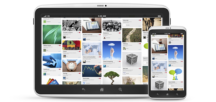
Responsive design. Boom. It’s the biggie these days and boy is everybody asking for it. It feels like it’s becoming the new “we have to get on social media because everybody else is” in many ways.
Truthfully, responsive design is important, just as social media is. The basic concept behind it is that you want your website to deliver information in a way that makes the most sense for usability based on the device it’s being displayed on. But the focus on responsive design also puts a heavy emphasis on the types of content being consumed – it’s important to know what content and how much content people are viewing when they come to your site on their phone.
Often the highest priority for an AEC website is photography – the portfolio! The work should shine. Add on a layer of focus on strategic marketing goals like SEO around certain target markets, inbound marketing, etc. and you’re putting together a good list of priorities for a website. But, pump the breaks – I need my entire website to be responsive! What is responsive when it comes to your portfolio? How much time, effort and money should be invested in reorganizing your entire website for mobile users?
I decided to take a look at the Google Analytics for every client website that we have access to and see what kind of data we could pull when it comes to mobile use. The aggregated results look like this:
- Average % of mobile visits – 13.64%
- Average pages per visit – 1.87
- Highest number of pages per visit for any site on a mobile – 3
So, when we look at how much content the average person is consuming via mobile device in our industry – the answer is less than 2 pages! This doesn’t tell us that responsive design isn’t important. In fact, it tells us the opposite. It tells us that if you want to maximize the usability of your website to clients and potential clients visiting via mobile – you would DRASTICALLY simplify what you’re delivering.
Here are three tips I would pull from this data to improve your AEC firm’s mobile-friendly aspects.
- Make contact info available on the homepage, immediately. Also, ensure your contact info is text-based, not an image. Mobile users only viewing less than two pages are probably trying call you or find you. Make it easy for their built-in phone and tablet functionalities.
- If you have a blog, and want people to read it – make sure it’s styled well for mobile. If you are very active on social media, a high percentage of your mobile traffic is probably driven from there. If you want people to keep coming back to your blog (or stick around on it), make sure the content is easy to digest.
- Responsive Web Design is just one piece of the puzzle. Don’t be afraid to consider that the majority of your website may just not be relevant to mobile users at all. Monitor Google Analytics, see what you can find out about your mobile users and don’t be afraid to design a mobile experience that is focused on their content needs instead of your design skills.